Project management charts greatly help project managers plan, schedule and track progress on projects of all sizes. There are many types of project management charts and there’s one for each stage of the project life cycle such as project initiation or project closing charts, for example.
There are also planning charts, diagrams and matrices for each of the key 10 project management areas such as cost, schedule, resource or stakeholder management.
Luckily for project managers, there are many alternatives when it comes to choosing a project management chart to facilitate project planning efforts. In fact, using those charts is often a need for project managers. You’ll need to use a Gantt chart or a work breakdown structure to build your project plan, which is the foundation of your project.
What Are Project Management Charts?
Project management charts are visual representations of data that turn difficult project management concepts into easily digestible assets. They’re mostly used for project planning and take many shapes such as flowcharts, network diagrams or bar charts. Gantt charts, PERT charts, CPM diagrams and WBS diagrams are great examples.
Project management charts are especially useful when you’re communicating complex project planning information. They visualize data and turn complex concepts such as your project schedule or scope into digestible data for the project management team and stakeholders.
Top 10 Project Management Charts
Before considering which project management chart is best for you, it’s important that you first decide which project management methodology you’ll use as there are differences between waterfall and agile project planning. It’s also important to note that you’ll need a variety of project management charts as each serves different project planning purposes such as creating a project timeline, allocating project resources, planning project work and more.
Below, we’ve selected the top 10 project management charts for project planning so you can decide which are best for your project.
1. Gantt Charts
Experienced project managers are familiar with the Gantt chart. It’s a dynamic bar chart that shows the project schedule on a timeline. Although Gantt charts started out as a basic tool, they’ve matured and include enticing features such as task dependencies that note when one task is related to another.
Gantt charts are essential for modern project planning and scheduling because they allow project managers to visualize all of the activities that make up the project on a timeline. They’re also useful to monitor progress once the execution phase begins.
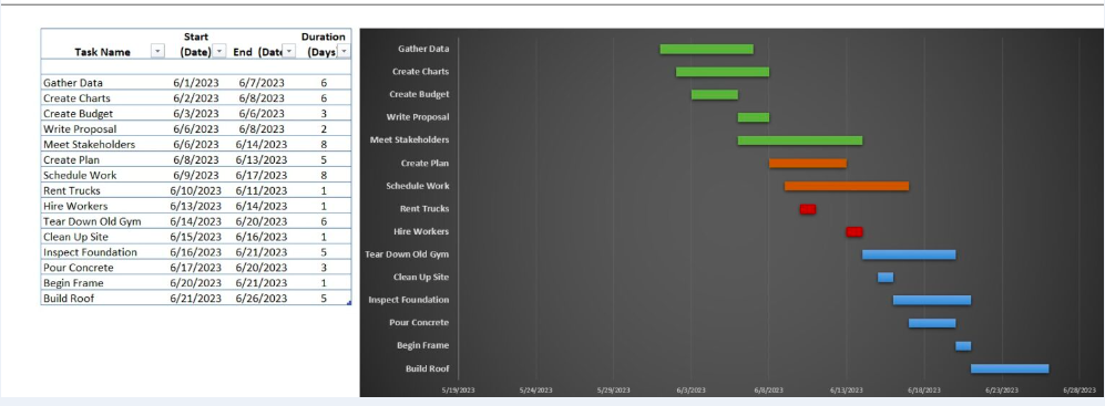
With new computing power, Gantt charts evolved from a basic bar chart to an essential project management tool that allows project managers to identify the critical path, assign tasks, establish task dependencies, generate a project timeline and much more. This is why most modern project planning software now includes Gantt charts.
Online Gantt Charts for More Flexibility
All Gantt charts aren’t equal; other project management software programs have Gantt charts, but they’re basic in functionality.
To start, ProjectManager can import your task list and schedule from a static spreadsheet. If your plan was developed in Microsoft Project but you want to move that plan online to share with your team, know that ProjectManager facilitates the import of Microsoft Project files.
Once you have your project plan in ProjectManager, our online Gantt chart is a project management chart on steroids. You can link task dependencies to prevent team members from getting blocked. You can also assign tasks directly from the Gantt view which is an interactive project timeline that you can adjust in real time. Comment at the task level and all status updates are instantly reflected on the Gantt chart, which feeds into a real-time dashboard with project metrics that can be filtered and shared.
For more information on Gantt charts, watch the short video below. It outlines all the ways that Gantt charts can help you make a thorough and effective project plan.
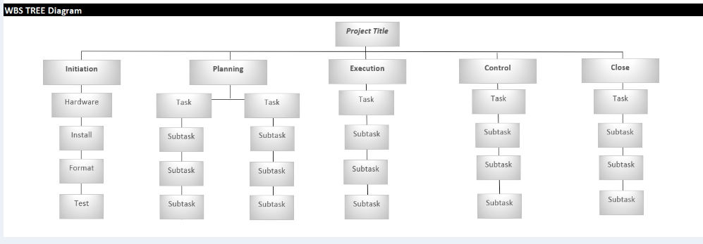
2. Work Breakdown Structure (WBS) Diagram
One aspect of project planning is organizing project activities, deliverables and timelines. That’s where a work breakdown structure (WBS) comes in handy. It’s a way to take the tasks a team must accomplish and split them into manageable sections.
The WBS is a deliverable-oriented hierarchical decomposition of the work to be executed by the project team. In other words, it’s a great way to visualize the tasks that need to be done in order to complete the project. It acts as a slightly higher-level view than a Gantt chart, which is useful for complex projects. A WBS can be represented as a list, a tree diagram, a spreadsheet or a column on a Gantt chart.
3. Flow Chart
Flow charts are another tool project managers should have in their toolbox when project planning. These charts help visualize processes as a way to improve project efficiency. The flow chart is a graphic display of the project’s objective and helps create a logical order of the work required to reach that goal. Planning a project is all about control, and a flow chart gives a project manager a tool to exercise control over tasks, resources and time. This means all processes, including planning and monitoring, refer to the flow chart to increase efficiency.
The planning process begins with the evaluation and development of the project scope. This might lead to a project level indicator or a project scorecard, both of which will flow into a project plan. Following the plan are tasks, resources, budgets, schedules, etc., each of which flows down to communications, risk management, change control, quality management, etc.
Finally, there’s the approval stage. If approved, the project plan is a go. If not, the flow chart circles back to the beginning to start again.
4. Critical Path Diagram (CPM)
Another visual planning tool is the critical path diagram (based on the critical path method, or CPM). It’s used to show the activities that are required to complete the project. The diagram illustrates the duration of each activity and the preceding activity, how the two are related and lag (the amount of time between two activities).
A critical path diagram helps project managers break down a more extensive project into necessary activities in order to deliver a successful project. These activities are represented on the diagram as boxes. Between these activities or boxes are lines that represent the flow to show how each activity is connected and interconnected.
The purpose of using a critical path diagram is to allow project managers to calculate the total duration of a project. The critical path is made up of critical activities but non-critical activities are also shown. Non-critical activities allow for more flexibility as they don’t have a major impact on the project.
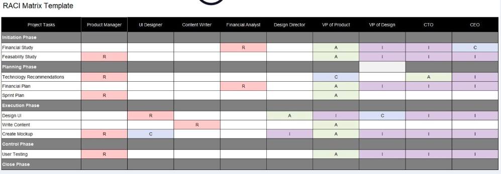
5. RACI Matrix
RACI is an acronym that stands for responsible, accountable, consulted and informed. A RACI matrix is a chart that helps assign responsibilities in project management. This table helps project managers identify stakeholders in their projects and gauge each level of involvement. This is done by noting next to each the initial R, A, C or I to categorize engagement.
For example, a responsible stakeholder means they’re directly responsible for the task. Accountable defines someone who delegates and reviews the work. Consulted means you’ll want this person’s input and feedback on the work being done, and informed are individuals who need to be updated on the progress of the work.
This is useful for assigning the responsibilities of team members on a project. But it can also be used to manage stakeholders. The RACI matrix helps a project manager to figure out which stakeholders need to know what and the frequency by which they should be updated on the progress of the project.
monly used to show the full business process and information flows, help employees understand their roles and responsibilities, expose redundancies and bottlenecks and avoid risks.
This project management chart can be made with software or drawn manually. Whichever route you take, you’ll get significant value from the workflow diagram. They help with operations and create greater efficiency by streamlining work. They also provide documentation for legal, compliance and audit requirements.
They’re a great tool for clear communication across the organization. Visual tools are often easier to digest no matter which department is looking at them. The workflow diagram is also a way to strengthen security. Workflow diagrams track information securely and make sure your organization is on top of any security gaps.
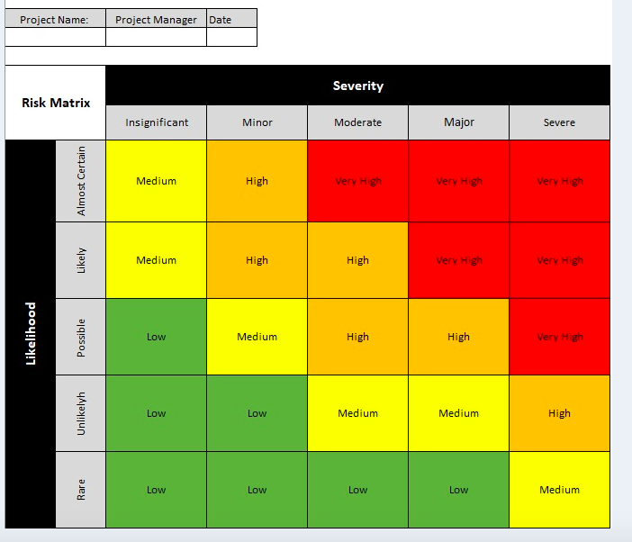
8. Risk Matrix
Risks can be good and bad, and project managers want to either take advantage of these unexpected opportunities or mitigate the impact of problems on the project. A risk matrix is used in project planning to identify and plan to resolve risks as they arise as issues in a project.
The risk matrix lists risks that could occur based on experience and historical data. The matrix represents the likelihood of the risk appearing in the project and the impact it will have if it does show up. Risks are categorized based on probability and severity.
This tool helps project managers with their risk management on a project. It also communicates the risks that might become issues in the project to the project team and stakeholders. This allows teams to quickly capture these issues and resolve them.
9. Milestone Chart
The milestone chart is a visual timeline that helps project managers plan for significant events in their project schedule. Milestones are important events in a project, such as delivering the project plan or the end of one project phase and the beginning of the next one.
Each vertical line of the milestone chart shows one milestone. There’s a description of the milestone on the left-hand side of the milestone and a horizontal time scale that charts the entire project. The milestone chart helps keep your team, stakeholders and customers updated on major project events.
Making milestones in your schedule and tracking them throughout the project is one way to stay on schedule. Sharing the milestone chart communicates the major events in the project and ensures that everyone is aware of them. It’s like having advance notice for big deadlines that must be met.
10. Burndown Chart
In agile project management, a burndown chart is used to visually represent how quickly the project team is going through the customer’s user stories and it shows the description of the features being worked on. These descriptions are from the perspective of the end-user. The burndown chart shows the team’s effort against the full sprint.
The work that’s still to be done is shown on a vertical axis. The time passed from the beginning of the project is shown horizontally. This presents both the past and the future so everyone can see where they are. The burndown chart is updated regularly to make sure it’s accurate.
There are two types of burndown charts: one is used for sprints, or short iterations when their agile team works on user stories, while the other is a product burndown chart. The latter shows the work that remains for the entire project, while the former is only what’s left to accomplish.