Buttons Design
Buttons allow users to take actions, and make choices, with a single tap
New buttons have updated shape, typography, and color mappings, dynamic color compatibility, and 3 additional types (elevated, filled, and filled tonal)—replacing the contained button
Usage
Buttons communicate actions that users can take. They are typically placed throughout your UI, in places like:
- Dialogs
- Modal windows
- Forms
- Cards
- Toolbars
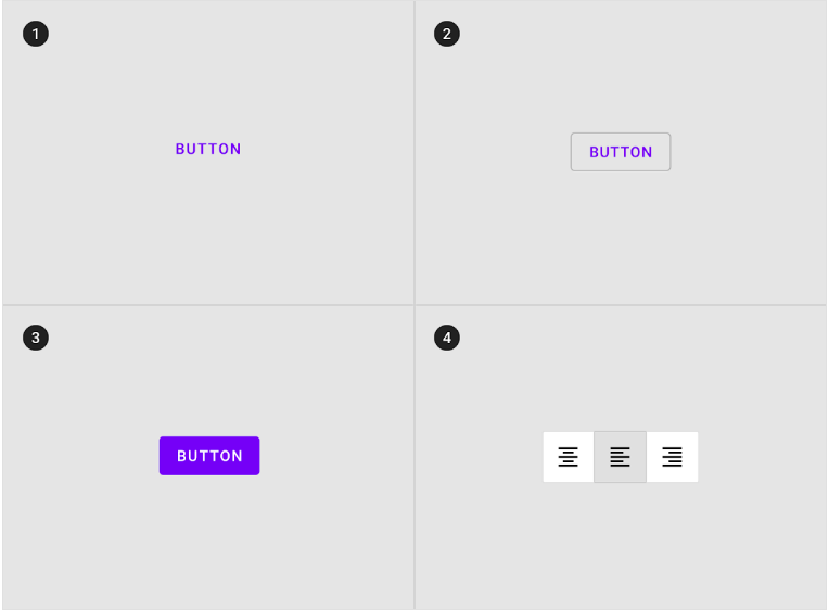
1. Text button (low emphasis)
Text buttons are typically used for less important actions.
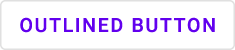
2. Outlined Button (medium emphasis)
Outlined buttons are used for more emphasis than text buttons due to the stroke.
3. Contained button (high emphasis)
Contained buttons have more emphasis, as they use a color fill and shadow.
4. Toggle button
Toggle buttons group a set of actions using layout and spacing. They’re used less often than other button types.
Anatomylink
Buttons contain one required element and four optional elements
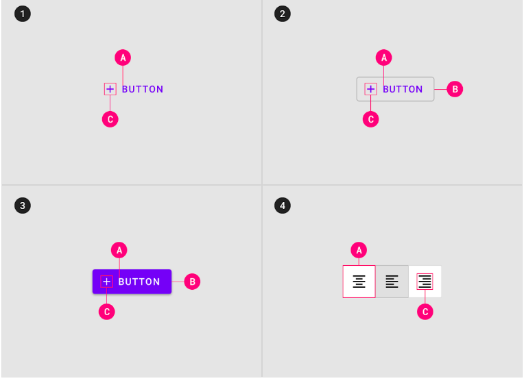
1. Text button
A. Text label
C. Icon (optional)
2. Outlined button
A. Text label
B. Container
C. Icon (optional)
3. Contained button
A. Text label
B. Container
C. Icon (optional)
4. Toggle button
A. Text label
C. Icon (optional)
Buttons Implementation
Using buttonslink
Before you can use Material buttons, you need to add a dependency to the Material Components for Android library. For more information, go to the Getting started page.
Note:<Button> is auto-inflated as <com.google.android.material.button.MaterialButton> via MaterialComponentsViewInflater when using a non-Bridge Theme.MaterialComponents.* theme.
Making buttons accessible
Buttons support content labeling for accessibility and are readable by most screen readers, such as TalkBack. Text rendered in buttons is automatically provided to accessibility services. Additional content labels are usually unnecessary.
For more information on content labels, go to the Android accessibility help guide.
Types
There are four types of buttons: 1. Text button, 2. Outlined button, 3. Contained button, 4. Toggle button
Text buttonlink
Text buttons are typically used for less-pronounced actions, including those located in dialogs and cards. In cards, text buttons help maintain an emphasis on card content.
Text button examples
API and source code:
- MaterialButton
The following example shows a text button with a text label.

In the layout:
<Button
    android:id="@+id/textButton"
    android:layout_width="wrap_content"
    android:layout_height="wrap_content"
    android:text="Text button"
    style="@style/Widget.MaterialComponents.Button.TextButton"
/>
Adding an icon to a text button
The following example shows a text button with an icon.

In the layout:
<Button
    ...
    app:icon="@drawable/ic_add_24dp"
    style="@style/Widget.MaterialComponents.Button.TextButton.Icon"
/>
Anatomy and key properties
A text button has a text label, a transparent container and an optional icon.

- Text label
- Icon
Text label attributes
| Element | Attribute | Related method(s) | Default value |
|---|---|---|---|
| Text label | android:text | setText getText | null |
| Color | android:textColor | setTextColor getTextColor | ?attr/colorPrimary (see all states) |
| Typography | android:textAppearance | setTextAppearance | ?attr/textAppearanceButton |
Container attributes
| Element | Attribute | Related method(s) | Default value |
|---|---|---|---|
| Color | app:backgroundTint | setBackgroundColor setBackgroundTintList getBackgroundTintList | @android:color/transparent (see all states) |
| Stroke color | app:strokeColor | setStrokeColor setStrokeColorResource getStrokeColor | null |
| Stroke width | app:strokeWidth | setStrokeWidth setStrokeWidthResource getStrokeWidth | 0dp |
| Shape | app:shapeAppearance | setShapeAppearanceModel getShapeAppearanceModel | ?attr/shapeAppearanceSmallComponent |
| Elevation | app:elevation | setElevation getElevation | 0dp |
| Ripple color | app:rippleColor | setRippleColor setRippleColorResource getRippleColor | ?attr/colorPrimary at 12% opacity (see all states) |
Icon attributes
| Element | Attribute | Related method(s) | Default value |
|---|---|---|---|
| Icon | app:icon | setIcon setIconResource getIcon | null |
| Color | app:iconTint | setIconTint setIconTintResource getIconTint | ?attr/colorPrimary (see all states) |
| Size | app:iconSize | setIconSize getIconSize | wrap_content |
| Gravity (position relative to text label) | app:iconGravity | setIconGravity getIconGravity | start |
| Padding (space between icon and text label) | app:iconPadding | setIconPadding getIconPadding | 4dp |
Styles
| Element | Style |
|---|---|
| Default style | Widget.MaterialComponents.Button.TextButton |
| Icon style | Widget.MaterialComponents.Button.TextButton.Icon |
| Full Width Buttons | Widget.MaterialComponents.Button.TextButton.Dialog.FullWidth |
Outlined button
Outlined buttons are medium-emphasis buttons. They contain actions that are important, but aren’t the primary action in an app.
Outlined button examples
API and source code:
- MaterialButton
The following example shows an outlined button with a text label and stroked container.
In the layout:
<Button
    android:id="@+id/outlinedButton"
    android:layout_width="wrap_content"
    android:layout_height="wrap_content"
    android:text="Outlined button"
    style="?attr/materialButtonOutlinedStyle"
/>
Adding an icon to an outlined button
The following example shows an outlined button with an icon.
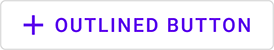
In the layout:
<Button
    ...
    app:icon="@drawable/ic_add_24dp"
    style="@style/Widget.MaterialComponents.Button.OutlinedButton.Icon"
/>
Anatomy and key properties
An outlined button has a text label, a stroked container and an optional icon.

- Text label
- Container
- Icon
Text label attributes
| Element | Attribute | Related method(s) | Default value |
|---|---|---|---|
| Text label | android:text | setText getText | null |
| Color | android:textColor | setTextColor getTextColor | ?attr/colorPrimary (see all states) |
| Typography | android:textAppearance | setTextAppearance | ?attr/textAppearanceButton |
Container attributes
| Element | Attribute | Related method(s) | Default value |
|---|---|---|---|
| Color | app:backgroundTint | setBackgroundColor setBackgroundTintList getBackgroundTintList | @android:color/transparent (see all states) |
| Stroke color | app:strokeColor | setStrokeColor setStrokeColorResource getStrokeColor | ?attr/colorOnSurface at 12% opacity (see all states) |
| Stroke width | app:strokeWidth | setStrokeWidth setStrokeWidthResource getStrokeWidth | 1dp |
| Shape | app:shapeAppearance | setShapeAppearanceModel getShapeAppearanceModel | ?attr/shapeAppearanceSmallComponent |
| Elevation | app:elevation | setElevation getElevation | 0dp |
| Ripple color | app:rippleColor | setRippleColor setRippleColorResource getRippleColor | ?attr/colorPrimary at 12% opacity (see all states) |
Icon attributes
| Element | Attribute | Related method(s) | Default value |
|---|---|---|---|
| Icon | app:icon | setIcon setIconResource getIcon | null |
| Color | app:iconTint | setIconTint setIconTintResource getIconTint | ?attr/colorPrimary (see all states) |
| Size | app:iconSize | setIconSize getIconSize | wrap_content |
| Gravity (position relative to text label) | app:iconGravity | setIconGravity getIconGravity | start |
| Padding (space between icon and text label) | app:iconPadding | setIconPadding getIconPadding | 4dp |
Styles
| Element | Style |
|---|---|
| Default style | Widget.MaterialComponents.Button.OutlinedButton |
| Icon style | Widget.MaterialComponents.Button.OutlinedButton.Icon |
Contained button
Contained buttons are high-emphasis, distinguished by their use of elevation and fill. They contain actions that are primary to your app.
Note The contained button is the default style if the style is not set.
Contained button examples
API and source code:
- MaterialButton
The following example shows a contained button with a text label and a filled container.

In the layout:
<Button
    android:id="@+id/containedButton"
    android:layout_width="wrap_content"
    android:layout_height="wrap_content"
    android:text="Contained button"
/>
Note: Since this is the default type, you don’t need to specify a style tag as long as you are using a Material Components Theme. If not, set the style to @style/Widget.MaterialComponents.Button.
Adding an icon to a contained button
The following example shows a contained button with an icon.

In the layout:
<Button
    ...
    app:icon="@drawable/ic_add_24dp"
    style="@style/Widget.MaterialComponents.Button.Icon"
/>
Anatomy and key properties
A contained button has a text label, a filled container and an optional icon.

- Text label
- Container
- Icon
Text label attributes
| Element | Attribute | Related method(s) | Default value |
|---|---|---|---|
| Text label | android:text | setText getText | null |
| Color | android:textColor | setTextColor getTextColor | ?attr/colorOnPrimary (see all states) |
| Typography | android:textAppearance | setTextAppearance | ?attr/textAppearanceButton |
Container attributes
| Element | Attribute | Related method(s) | Default value |
|---|---|---|---|
| Color | app:backgroundTint | setBackgroundColor setBackgroundTintList getBackgroundTintList | ?attr/colorPrimary (see all states) |
| Stroke color | app:strokeColor | setStrokeColor setStrokeColorResource getStrokeColor | null |
| Stroke width | app:strokeWidth | setStrokeWidth setStrokeWidthResource getStrokeWidth | 0dp |
| Shape | app:shapeAppearance | setShapeAppearanceModel getShapeAppearanceModel | ?attr/shapeAppearanceSmallComponent |
| Elevation | app:elevation | setElevation getElevation | 2dp |
| Ripple color | app:rippleColor | setRippleColor setRippleColorResource getRippleColor | ?attr/colorOnPrimary at 24% opacity (see all states) |
Icon attributes
| Element | Attribute | Related method(s) | Default value |
|---|---|---|---|
| Icon | app:icon | setIcon setIconResource getIcon | null |
| Color | app:iconTint | setIconTint setIconTintResource getIconTint | ?attr/colorOnPrimary (see all states) |
| Size | app:iconSize | setIconSize getIconSize | wrap_content |
| Gravity (position relative to text label) | app:iconGravity | setIconGravity getIconGravity | start |
| Padding (space between icon and text label) | app:iconPadding | setIconPadding getIconPadding | 4dp |
Styles
| Element | Style |
|---|---|
| Default style | Widget.MaterialComponents.Button |
| Icon style | Widget.MaterialComponents.Button.Icon |
| Unelevated style | Widget.MaterialComponents.Button.UnelevatedButton |
| Unelevated icon style | Widget.MaterialComponents.Button.UnelevatedButton.Icon |